
BLOG POST:
Color That Stays True Brand-Accurate Custom Banners San Francisco Across Venue
Your brand has a color. It could be a certain shade of dark navy. It could be a bright forest green or a warm coral. That color is a part of who you are, and when your banner shows up at a trade show, street fair, or store front looking a little different than your logo, people will notice. It doesn’t feel right. It looks bad for business. And it happens more often than most business owners think it will.
One of the most common problems with ordering “custom banners San Francisco” businesses use at a lot of different events and places is this. The design looks great on the screen. Then the banner comes, but the color isn’t quite right. It matches the first banner you printed, but not the second one from a different vendor. The good news is that this problem can be fixed completely. The first step is to understand why color accuracy is important and how to get it right every time.
Why the Colors of Your Brand Change from Screen to Print
Most people make their banners on a computer. RGB is the name of the color system used by screens. Red, green, and blue light are mixed together to make all the colors you see. But light doesn’t work with printers. They use ink, which is a different system that mixes cyan, magenta, yellow, and black on a physical surface.
Color drift happens when you change from RGB to CMYK. When a color hits vinyl or fabric, it can look duller or slightly off-tone than it does on your screen. And since each screen is set up differently, the color you see on your laptop may not be the same as what your designer sees on theirs.
The Pantone System Solves This Issue
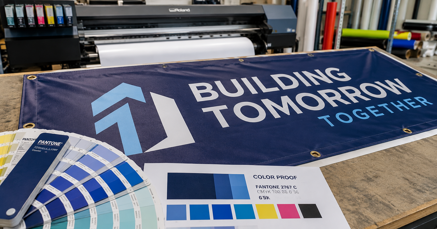
The Pantone Matching System (PMS) is the industry’s answer to this problem. It is a standardized color library that gives each shade a unique code. You don’t just tell a printer to “make it blue.” You give them a Pantone number, like PMS 2767 C, and they know exactly what ink to use. No matter what material it is printed on or which print shop does the work, the result is always the same exact color.
This is why big companies like Coca-Cola and Tiffany & Co. always use the same colors on all of their printed materials. They use Pantone codes to tie everything together. This is the way to go if you want your banners to look just as good at Salesforce Tower as they do at a weekend pop-up in the Mission if you own a business in San Francisco.
How the material changes the color, even when the ink is the same
A lot of business owners are surprised to learn that the same ink color can look very different depending on what it is printed on. The light that hits a glossy vinyl banner makes the colors look brighter and more vibrant. A matte fabric banner lets in more light, which makes the same color look softer and less bright.
If you have a gloss vinyl banner at one event and a matte fabric banner at another, your brand color may look like two slightly different shades next to each other. This is most important when your banners are at the same place at the same time or when you are taking pictures of them for marketing materials.
Part of the job is to match things up across materials.
A professional custom banners San Francisco printer should make sure that colors match across different surfaces during the proofing process. A good printer will change the ink values to make up for the fact that a matte or textured surface takes in color differently than a smooth gloss finish. The goal is for all of your materials to look the same to the human eye, even when they are printed on different types of paper.
Before we print a single square foot, we check your brand color specifications at San Francisco Signs & Printing. We use your Pantone codes, CMYK values, or existing brand files to make sure that everything we make for you matches your brand, not just one banner.
Getting a Proof Before You Sign
The proof is one of the most important parts of any banner order. It’s a digital preview of your final design before it goes into production. A good proof shows you the text, the layout, and the color values that will be printed. But the RGB-to-CMYK gap still applies to a digital proof on a screen.
A physical print proof on the same material that your banner will be made on is the best way to check brand-critical colors. You can hold the printed material in your hand and compare it directly to your brand standards, like a Pantone swatch book, an existing piece of printed collateral, or your brand style guide, before the whole order is made.
This extra step only takes a day or two, but it makes sure you don’t get a full order that is a little bit wrong. That peace of mind is worth it in San Francisco, where your banner could be representing your brand at a big event.
What to Give Your Printer to Get Accurate Results
The more clear you are with your printer about what colors you need, the better your results will be. To get the best results, give us your Pantone codes (make sure to say whether they are coated or uncoated), your CMYK breakdown, the file type of your artwork (vector files like AI or EPS work best for sharp reproduction at large sizes), and any printed materials you want your banners to match.
Your graphic designer or brand style guide should have your Pantone codes if you don’t know what they are. If your brand was made without Pantone codes, a professional print shop can help you find the closest match before they start making it. You can also check out our blog for more tips on how to get your files ready and pick the right materials for your next banner project.
Final Words
Getting the colors right is important. It’s what makes a banner build trust in your brand or quietly hurt it. Your business looks like a well-run, polished operation when every event, venue, and banner looks the same as the last one.
If you’re ready to order custom banners that San Francisco businesses can count on for consistent, brand-accurate color across all venues and materials, contact San Francisco Signs & Printing today. Every time, we will make sure your color stays true.