Template articles

Frontpage elements

by blodrayneroncreedoCM

Menu swipe

The main menu supports opening by the swipe gesture from left to right over the menu bar with logo. Menu can be also closed using the swipe gesture from right to left.

Frontpage suffixes

  • no-bg - disables the white background under the content area
  • no-sidebar - disables the sidebar
  • fixed-content - adds a fixed position for the content block
  • full-width - expands the content for the full width of the browser

Frontpage Image Overlay
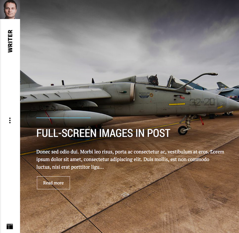
In this mode template uses the Frontpage Image Overlay portal mode from our News Show Pro GK5 module. The image should be fixed positioned so please also add for page with it the fixed-content page suffix. For the proper image positioning, please also add for the module the frontpage-overlay suffix.

Portfolio styles

Both portfolio listings uses the Portfolio Grid portal mode from our News Show Pro GK5 module. For both cases please also use the no-bg, no-sidebar and full-width page suffixes.

The above style is a standard configuration of the Portfolio Grid portal mode. You can disable popups in the portal mode settings. Please also remember that gallery supports the swipe gestures for navigating between displayed images.
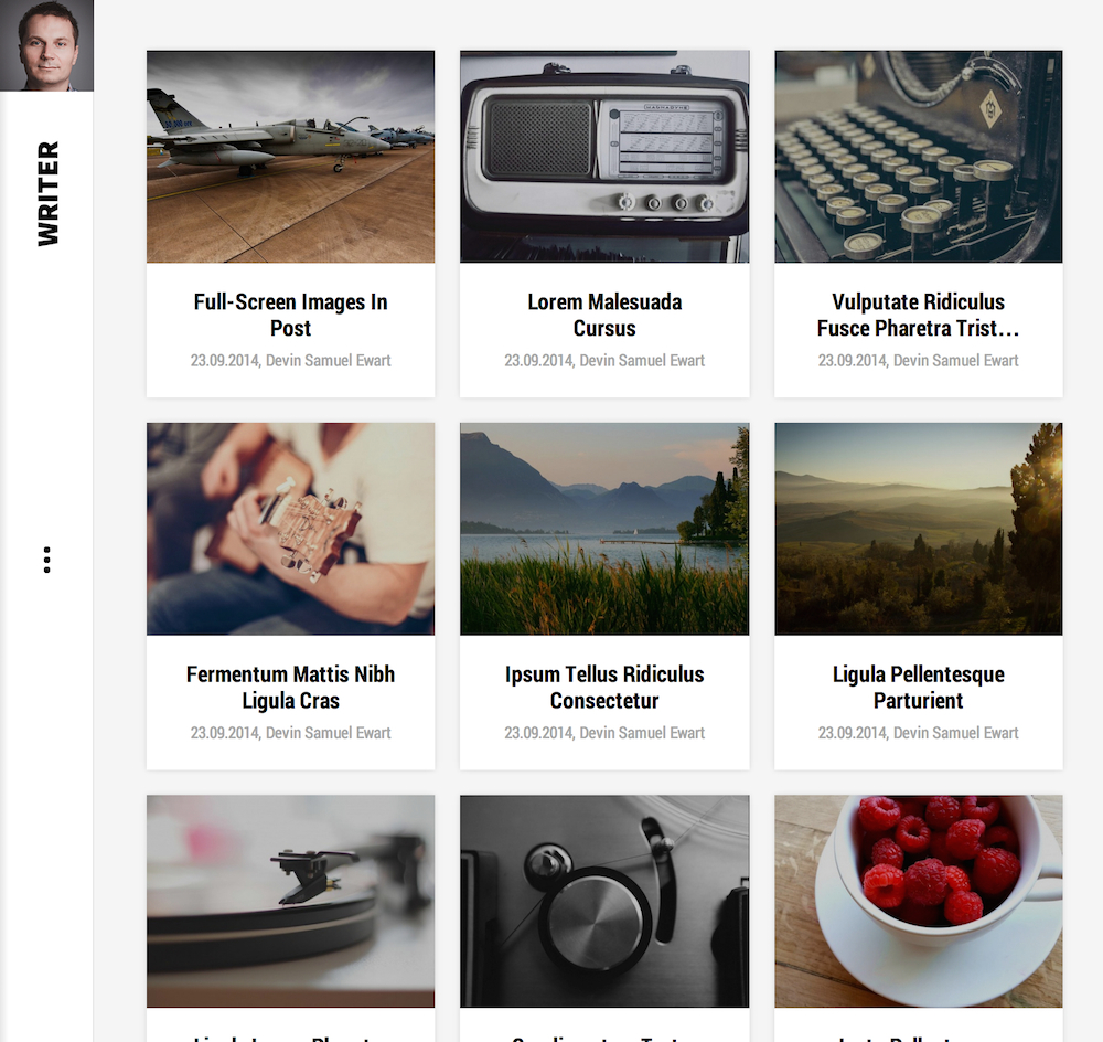
In order to achieve the above style, please disable overlay in the Portfolio Grid portal mode.
Template features

by KindzaQBR

Logo configuration

Logo

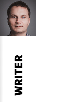
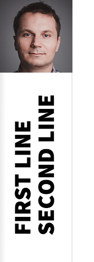
Logo in the Writer template can be configured using few options (located under the Features tab in the template options) and is based on the two elements: logo image and logo text. The logo image can be set by your own upload or by your Gravatar image - in the second case you have to specify your e-mail connected with your Gravatar account in the template options. The Gravatar image will work only when you leave blank the logo image option.

The logo text can be specified in one or two lines. If you want to use two lines text, you have to put in your logo text the break like by using the [br] string and you have to enable two lines mode in the logo options.

Logo - two lines

The above logo uses the following text: First line[br]Second line and uses the two lines mode with text indent set to 116.

The last important option is text indent - it specifies the negative left margin for the text. If you will use the longer text in the logo, then you should also use bigger text indent option value.

Social icons

Social Icons

Social icons are placed on the social module position, and uses the following HTML code:

<a href="#" class="gk-icon-vimeo"&rt;Vimeo</a&rt;
<a href="#" class="gk-icon-gplus"&rt;G+</a&rt;
<a href="#" class="gk-icon-linkedin"&rt;linkedIn</a&rt;
<a href="#" class="gk-icon-twitter"&rt;Twitter</a&rt;
<a href="#" class="gk-icon-fb"&rt;Facebook</a&rt;
<a href="#" class="gk-icon-youtube"&rt;YouTube</a&rt;

Page Break

Lorem ipsum dolor sit amet, consectetur adipiscing elit. Proin posuere nisi quis odio egestas non tempus est sollicitudin. Nulla facilisi. Pellentesque tempus suscipit nulla sed tempor. Phasellus et lorem id libero fermentum molestie sit amet sit amet mi. Quisque ultrices, neque et laoreet dictum, arcu sapien pulvinar odio, in aliquam mi dui eu leo. Nullam posuere, arcu et egestas fermentum, enim purus fermentum diam, quis porta mauris lectus ut odio. In tincidunt dapibus malesuada. Integer a lorem ligula. In tincidunt augue eget velit convallis nec pharetra eros tincidunt. Maecenas et tortor libero, vel malesuada est.

Quisque magna tellus, condimentum a porttitor eu, fermentum nec enim. Aenean et erat nec lectus adipiscing auctor. Sed tellus sapien, condimentum eget tristique ac, faucibus sed nisi. Curabitur pretium porta pulvinar. Integer cursus venenatis dictum. Morbi massa est, ultricies ut ultrices vitae, hendrerit vitae tellus. Duis a nulla quis tellus lacinia tristique.


Quisque magna tellus, condimentum a porttitor eu, fermentum nec enim. Aenean et erat nec lectus adipiscing auctor. Sed tellus sapien, condimentum eget tristique ac, faucibus sed nisi. Curabitur pretium porta pulvinar. Integer cursus venenatis dictum. Morbi massa est, ultricies ut ultrices vitae, hendrerit vitae tellus. Duis a nulla quis tellus lacinia tristique.

Donec libero urna, cursus vitae sollicitudin sit amet, elementum et massa. Donec feugiat, turpis a dictum vulputate, dui diam faucibus nunc, ac sodales augue magna id augue. Pellentesque habitant morbi tristique senectus et netus et malesuada fames ac turpis egestas. Donec sit amet nisi felis. Morbi faucibus nunc id elit aliquam ac condimentum leo laoreet. Sed nec risus sed nulla mattis volutpat in eget diam. In leo nisl, eleifend vel lobortis vel, tincidunt a ligula. Nulla placerat gravida laoreet. In lobortis, ligula in sagittis pellentesque, orci magna venenatis neque, eu sagittis lacus ante et tellus. Morbi vel semper augue. Lorem ipsum dolor sit amet, consectetur adipiscing elit. Aliquam erat volutpat.

Page break example

Ut dignissim aliquet nibh tristique hendrerit. Donec ullamcorper nulla quis metus vulputate id placerat augue eleifend. Aenean venenatis consectetur orci, sit amet ultricies magna sagittis vel. Nulla non diam nisi, ut ultrices massa. Pellentesque sed nisl metus. Praesent a mi vel ante molestie venenatis.

Donec sed odio dui. Cras mattis consectetur purus sit amet fermentum. Nullam quis risus eget urna mollis ornare vel eu leo. Donec id elit non mi porta gravida at eget metus. Etiam porta sem malesuada magna mollis euismod. Cras justo odio, dapibus ac facilisis in, egestas eget quam.

Module variations

On this page you can see basic suffixes used in this template.

01The clear suffix is very useful to create banners or images without additional borders, margins and paddings.

02For the News Show Pro GK5 and Tabs GK5 modules please always disable usage of the default CSS styles in the module settings.

03If you want to hide the sidebar please use the no-sidebar suffix. Full width for the content can be achieved with the full-width suffix. The white background under the content can be hidden with the no-bg suffix.

04 The News Show Pro GK5 module has two special suffixes: latest-posts-right and latest-posts-left which can be used for creating posts listings with image on the left or right side.

Messages

Joomla! offers three different types of messages. Creatings standard information about Joomla! system is presented depending on a message type as follows:


Error
  • This is a sample message
Error
  • This is a sample of notice message
Error
  • This is a sample of error message

Typography

Call or text us (415) 335-9365